Monday 22 July 2013

~~ Assignment #10: Gastown Scavenger Hunt ~~

Boots *
                      As the list say' boots, and I found this boots store so I took a picture thinking I found the one Im looking for. I used the angel of view to make an accurate shot, because the boot is actually big and I have to angle my camera to take it and have a feeling that you are in this place seeing it from your own eyes and also have this natural feeling on the background.

Wheels *
                    For this picture, I used the rules of third and I guess angle of view. Because the as you can see the huge wheel is tilted a bit on the left and angle it to view the whole place showing how massive the wheel is. I dont have any complain about the photo, it's superb in my prospective.

I'm hot & steamy *
                   When they said hot and steamy, I thought the clock is whistling smoke and dripping hot water and this is it the one I'm looking for. The photograph is pretty much simplicity and shows scale because it shows how tall the clock is comparing to the people around and the whole atmosphere is calming but it concentrated on the elegant clock. I liked the picture so much because it present the old fashion vancouver.

Trounce Alley *
                  I dont know why but I liked the picture so much, it tells a background that is pretty shocking. Trounce Alley or so called Blood alley, they said that this specific area is a jail place and a butcher house back in the days, and they said that blood from the butchered animals flows and floods the place so thats why its called blood alley. But any how, I used none of the compositional rules but I guess it goes to the category of framing because I took the sign to show people its history. 

Stairs *
                      I chose this picture and I liked it because from a far, it shows the style and how old fashion it is and plus the built in stairs are build in purpose for it is noticable in the eye. For this picture, contrast and texture is used, for the color of the bricks are so red matching it with dirty yellow in the middle makes it visible in the eye, and texture because you can see that the used material to make this building is especial for it lasted for years and it gives a depth of feeling when you look at it.

Light *
                     When we passed by this place, I thought of light as it says in the list so I took a shot. I do liked the picture because its inviting and chill in the eyes. I used the angle of view to take the whole thing and show the pleasant feeling of the place, the view makes the eye feel welcomed and calm inside.

Gaoler Mews *
                         I love this photo so much, I get the feeling of the past and this place is pretty historic. Contrast and angel of view is used in this picture, the color of the sign with the color of the bricks makes me want to stare at it and think about the history of it and plus its playful in the eye, and also angel of view for actually the sign is three feet above me so I have to angle it upwards to take a picture and have that dramatic style when you looka t it.

W *
                        The huge "W" signs on top, it looks so cool but I just dont like it that theres so much blockage so I didnt make a good shot, this is pretty much the best one that I took. The W signs shows contrast and scale, because the red color is noticable and made it like a tourist attraction, and imaging the size of it, it already look big from a far imagine if you get close to it, it will be massive.

Working Hard *
                          I thought of working hard so I took of men working hand to hand with dirt all over them, it actually looks cool to see people working hard like this. I guess I used the angle of view and simplicity for this one, not much to tell but the picture itself already tell something and I angled it to make it more better for a shot.

New vs Old *
                      I liked this picture for the New vs Old example, because it cleary show an old building beside the new one. Its pretty cool to think that they havent got rid of the old buildings and instead make a new one and keep the old ones. For this photo I think I used scale, because you can see that the old one is shorter than the new one, in my own understanding, the meaning of scale of this one is that the structure and how how old the shorter building is compare to the new ones, so much interpretation but I think it will fit to the category.

~~ Assign #11: Final Edit ~~

Original Photos *


Final Edit *

                      I chose the purple flower I found in the quay and the ping pong ball that I placed in the greenery, because these are one of the most perfect pictures I took in this photography class. I did'nt do any editing in the original photos, I pretty much used cloudy for the ping pong ball pic because the skies in that day is pretty grey and auto for the purple flower for the weather is very sunny. I lessened the darkness and shady kinda feeling in the purple flower because you can see that theres too much shadows and I did a bit of cloning to hide some unwanted parts in the picture to make it more elegant. And for the ping pong ball picture, I brightened it to bring up the innocense feeling the greenery bring and the pure white contrast of the ball, and also to eliminate some icky dark shades from the dark corners and wholes. I dont have any dislikes on the photos,I did'nt do much to change it but I guess I did some changes in the flower one pic I'm satisfied of the photographs I chose so I picked it and posted it for my final edit.

Sunday 14 July 2013

~~ Assign.#9: Contrast,Texture,Repetition,Angle of View ~~

Contrast *

Texture *

Repetition *

Angle of View *


                   For all of the photos I took, I did'nt use any camera adjustment because the sunlight is already perfect for snapshot. The first picture, contrast photo, is accomplished because I noticed the bright transparent color and it matches the deep green color of the leaves, and along with the sunlight that hits the flower makes it more vibrant in my opinion. Nothing much is wrong with the photo, but I guess the spaces and the spot where I took it is pretty much off.
                The second picture which is the texture photo, has this bushy spiky but kinda like smooth feelings to it. When I first saw the plant I thought that it is clumped up together but when you get closer it is soft and perfect for texture, it is vibrant and totaly give you this sensation when you look at it. I dont have much anything to dislike about this picture but I think it would be better if I edit it just a little bit to make it extra nice.
               The repetition photo is legit a repetitional, I used the white baracades that falls in a row and I think everything is solid in that picture.
               Lastly the Angle of view photo, has this quirkyness feelings to it. I used this small red berries to contrast the ground and angle my shot towards the white baracades to have this style and effect to it. and I think I did a good job, everything is else is coming along like the plants that hanged on the tall street lights, and it's all simply good.

~~ Assign.#8: Scale,Depth,Framing,Simplicity ~~

Scale *

Depth *

Framing *

Simplicity

         
                     For the first picture, I took the girl with the baby cow for the scale photo. I didnt pretty used any camera adjustment for this but it can show a good example of the picture, the girl beside the cow show's the difference between their sizes and it's amazing how can you imagine how big the baby cow is. I just dont like dark background but lucky the sun hits the spot where my two model are and it's noticeable to the eye because of the color of the cow.
                     The depth, framing,and simplicity photos are all taken at the quay. I used the automode because the natural atmosphere of the environment is already perfect for my camera. The depth picture have these gorgeous transparent like look to it, and I can tell that theres dimension as the flower and the boat and the girl gets farther away. I just dont like the aura the light giving I noticed theres too much shadow.
                    Framing photo that I took is in my opinion is perfect, I modeled my teacher and acurately took one inside the boat. And plus the killer whale statute is nice really good picture for this one.
                    For simplicity photo, I took some lady's dog and the white fur of it pleases me. The bright sunlight brings the dog's color and it just simply perfect on any background you take picture with the dog with. So far I have no complaints about this picture.

~~ Photo Challenge "NATURAL" ~~

For me beauty comes from the inside and out, My aunts really caring and nice, no makeup just put a smile and makes everyone feel warm inside. Love you aunti. :)
When you say natural, the first thing that comes in mind is nature, and I love nature so much, the flower and all that greens just simply beautiful. :)

~~ Photo Challenge "LOUD" ~~

Pretty much being by myself at home to me is like a loud noise that tears my ear, I dont know but it's more louder and disturbing when your alone.
Well this kind of loud is the most I hate, dont like it when people make too much unnecessary noice, but the party is fun though. -.-

~~ Photo Challenge "SMILE' ~~

Enjoying the sun makes me smile, even though theres alot of things going on for some reason the heat gives me enthusiastic feeling and it generates me all over my body. The sun is healthy for you.
\
Also chilling with my family makes me happy, so much!
Music is part of my life, cant really live without it, everyone loves music. :)

Wednesday 26 June 2013

~~ Rules of Third and Leading lines ~~


I chose more on flower and green, because it soothes the eyes and the day that I took these pictures it is pretty much rainy, the clouds are grey and not much light it provided. when you look through the pictures you'll see that they are more to the corner which gives more things to look through and more edge.


What I dont like about the pictures I took is that the background and whole colour are bland, and it's not really interesting when you look at this pictures. And I noticed that the reason the photos are not really appealing is beacuse the lines aren't leading anywhere, it is simple but I think it needed more of a professional edit and the needs of the natural light in the environment.

Wednesday 12 June 2013

~~ White Balance Comparison ~~~


I noticed that the pictures I took pretty much blurried the front object, it enlightens and cleared the background, and it looks more pleasant than the object taken. The mode that I choose to balance that lightings work well on the bottom picture, I took the pictures outside and I found out the mode I choose works well for the natural light of the outside surrounding.  It kinda fails on the first pictures from the top photos, beacuse it didnt get the designated light it wants for the camera mode i choose.

Wednesday 5 June 2013

~~ Photo Comparison ~~~~~


As what I see on the pictures that I took, is the light or the fading of pictures as it goes down from top to bottom. The pictures actually didn't put more light or to make it more visible for the people who will see the picture, but the camera tries to faded it up to eliminate the dark shades the EV exposure from the camera can provide. The top pictures show's a not really pleasant visuals because it darkens most of the materials on pictures and you cant see it, for its a picture and what you took it has to show all the details of the photo that you wanted to take. It's the same as the lightest one in contrast, it takes off the other details a photo has show. Only the middle one of each photos has the best light and dark shadings, and it balances the EV and ISO of the camera used to take the photos, I think all of the cameras are often automatically set on the balance mode just like middle photo on both pictures, it just depends on the light and the atmophere of the surroundings that the camera has to be adjusted and automatically adjusted for the photographer, that's why the levels of EV and ISO of the cameras are available, but sometimes it is kind of irritating to adjust and change all the things to make a perfect shot. In this case, I used an old model of camera, thats why the effects and the qualities are not that good.

Friday 24 May 2013

~~~ Discovering "My" Type of Photography ~~~

                                                     
 http://vnandcam2011.wordpress.com/


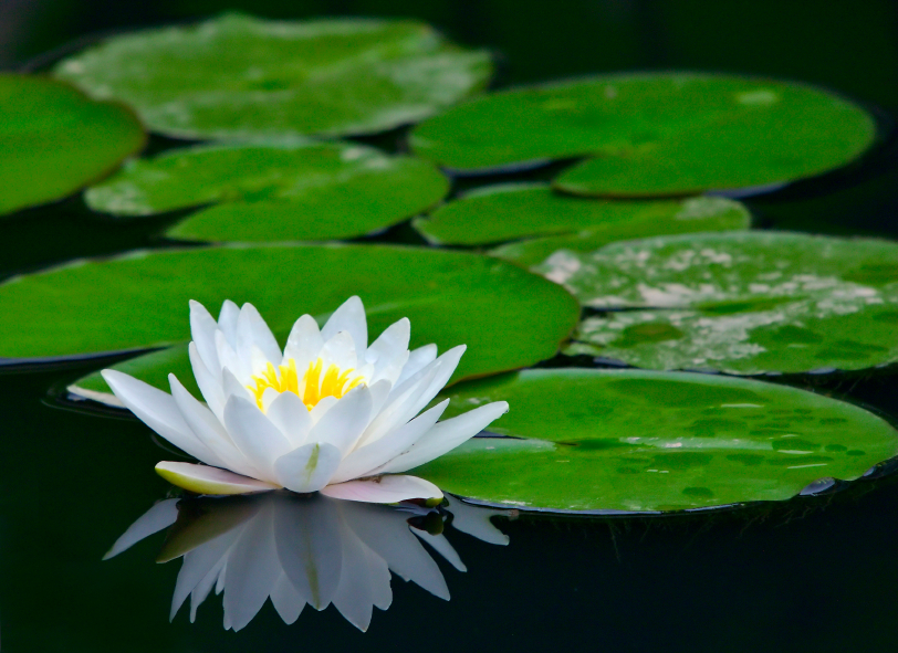
                                                  * Lotus Flower - simplicity *
 
I really love photographs showing simplicity and innocense. The nature, weather, cultures and some specific object that implies emotions, love, and good intentions, also some dramatic photographs that tells an interesting story behind it; expressing a word that a photograph that wants to show and how are you connected to the image it represent. Showing the soul and beauty and does'nt hurt other objects that can be included. I like it more when a photograph does'nt really over due the deatils, a simple nice picture just like photograph above, expresses such beauty, that without any other things on the surrounding, it already shows a superb attitude and sense it wants to tell us. And the cooling colors, it just warms and calm our hearts with its sensitive appearance, not to mention that the photograph only shows an elegant lotus flower floating on the water and the pleasant round leaves that compliments the flower, just a single flower standing out and the focus of the whole subject.


Wednesday 8 May 2013

Chapter 1 ~~~ My first task ~~ ( thoughts and fears of my first ever blog )

      Creating my first ever new blog,. learning and exploring new things, with pictures, letters, colors, informations and techniques that i've never been experience before. It's going to be exciting.
      In the beggining, I actually thought that were going to do more of photographing and taking picture of things like nature and some sort of art picture that we have to study,and each one of us will be given this huge  proffesional camera. But Im surprised that we came in to this room and I kinda had this idea that, yes, we are going to do some computer thingy and I felt a bit down, but it's not really bad because my teacher explained everything and what are we suppose to do and expect in this subject. I'm pretty happy of this course nothing really much to worry about, and i feel much more confident now that we have an idea to what we should work on and my teacher is there to help us.
      I'm pretty thrilled and , I cant wait for the challenges that this course will give, I'm hoping it will be fun<3.